PH VFX x SCAD Week Six - Textures
- kpradley
- Nov 11, 2022
- 3 min read
Updated: Nov 15, 2022
This week, I took a focused eye to create the textures needed for our CG elements. We needed textures for the obelisk, the base the obelisk stands on, the flag, the flagpole, and the cracks which spread across our actor's face.
Professor Gaynor knew I was working with shading and texturing the obelisk, so she presented me with a school of thought that would inform the direction I went. She told me to "Interview the object."

This is a concrete texture I pulled from Polyhaven.com, color corrected to be purple, and used for a quick camera move integration test around week 2.
Interviewing the Object
Interviewing our CG object means asking all the questions necessary to find out how it would look. These questions include "what is this object made of?" "what culture/civilization made this object?" "what forces are there in this object's environment that would weather it?"
Initially, Jadyn created textures for the obelisk and the base, taking on an Egyptian obelisk look with hieroglyphic inscriptions and a gravestone texture inspired base. There was a bit of confusion there, as I thought I would be doing the obelisk texture as our team's CG generalist. So I kept her gravestone base texture, it was near perfect, and began work on an obelisk texture closer matching my storyboards.

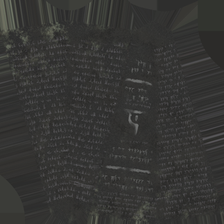
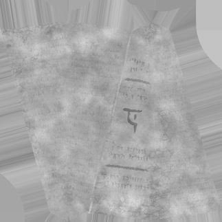
With just these two images, you can begin to see the journey this important texture went through. Above is Jadyn's original obelisk texture. Although it did a well enough job, it existed for an obelisk model without beveled edges, giving unrealistically sharp corners. Below is my final version of the texture. It has some grime from algae or lichen that might be found around the ocean, and is more of a concrete or stone instead of a black, reflective granite texture. This was at the behest of Professor Gaynor, who wisely noted that a black, reflective texture would require a moving reflective plate of our actor's hand and face, something we did not have.
The runes from this were created from the font "Iokharic" from Dafont.com. Typography is something I have somewhat of an interest in, and finding fonts for any project is something people often underestimate to convey theming.

Using this font, I typed enough letters to fill an appropriately sized column.
With these blocks of text and lines drawn with a chalk brush in Photoshop, I created an effective stencil to use in Substance Painter. The main glyph on the front of the obelisk is the letter "X" in the Iokharic font. After consulting with my group, I felt it was important to have one large glyph to draw audience focus, something large that would be easy to make light up in compositing.
Just for fun, here's what the block of text on the sides of the obelisk looks like decoded.

Flag Texture
Already having a head start with the flag texture I created for the previsualization, I was also responsible for creating a realistic looking ancient fabric with the glyph I designed.
The following is the process I took to get the flag to look a little more weathered, fixing the UVs after changing it from a 2D object to a 3D object, and making it look more like cloth as opposed to a red polygon.

Flag Texture used in Previsualization
Flag Texture used in first Lookdev Turntables
Final Flag Texture
Flagpole
While I was at it, I also went ahead and created textures for the flagpole. Yachan helped me out in the CG by creating our model of the flagpole based off an image of a spear. She also created a texture for it, but it was not UV mapped correctly, and had an unpleasant stretching around the handle of the spear.

Reference Image
First Iteration of Flagpole Texture. Mentors and team found it was too light.
Iteration 2 of Flagpole Texture
Flagpole Handle Texture. Model needed to be split into 2 parts to truly fix UVs





















Comments